The Decline and Fall of Marantz
under Superscope
Market conditions, wild counter-claims from lesser manufacturers, available capital, costs of extreme high-end R&D (such as this unit), all of these surely contributed to the eventual collapse of the Marantz brand under Superscope's ownership. But I think I have identified another factor which, to my admittedly critical eye, may have had a larger impact than all of the above put together - because it would have eaten away at the very basis for the entire operation: Sales!
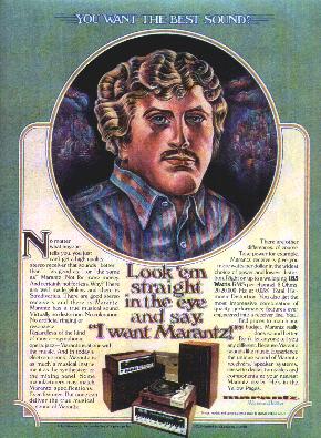
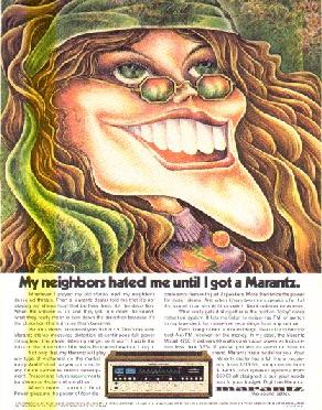
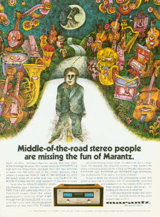
One reason Marantz, under Superscope, might have encountered so much difficulty in the 1970's is the ad campaigns it ran, which often used "uglified" cartoons and caricatures to extol the virtues of their equipment. I don't know how most people reacted, but personally, I think these are easily the worst stereo ads ever fielded by a high end audio manufacturer. You'll also encounter this theme on the playing cards in the Miscellaneous portion of the database. Other, more effective ad themes are also shown here as counterpoints to the problems described:

Do you want to be this guy? He looks like a failed plastic surgery experiment! |
...and this one looks like a victim of plastic surgery and sunburn. |
This is the same (terrible) theme as the Marantz playing cards |
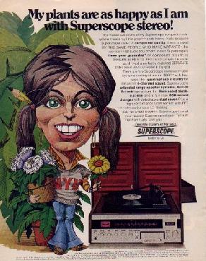
A Superscope ad, showing the same general attempt at a "mod" approach |

Apparently, someone at Superscope was a country music fan. Unfortunately, the demographics of country listeners are decidedly biased towards lower-income individuals, which means that as a market for Marantz gear, these ads were very poorly targeted. |
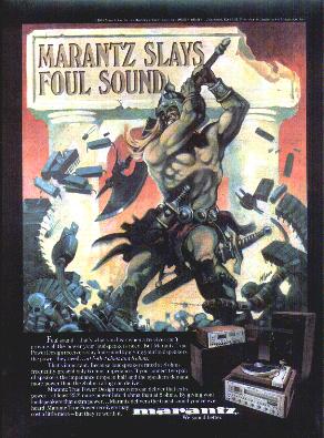
This, I think, is finally a good ad (circa 1978.) Perhaps too little, too late, it highlights art in a style that appears to me at least to be likely to attact a better funded customer; the visual message is positive, kinetic and highly competitive. We also encounter this theme in this promotional item |
Sigh. |
|
|